Accessibility is not an afterthought
Posted: January 30, 2026
Accessibility is not an afterthought. You should be accommodating to the many, many people out there with disabilities who want or need to access your services. This is good business sense–more people can use you features with ease, raising user satisfaction and increasing your reach to a wider audience. Accessibility is also required by law in many situations.
As well, remember that disability is the only minority group you can join later in life–an accident, a repetitive stress injury, or simply aging can make you disabled. One day, one of the people who needs accessibility features to use your app may be you.
O you who turn the wheel and look to windward,
Consider Phlebas, who was once handsome and tall as you.
Semantic elements
HTML semantic elements are a way to convey the structure of the page to scripts, styles, and most importantly, users: a <search> tag denotes a form or field you can use to search the page; a <table> tag denotes a table of rows and columns; and so on. Here is the MDN list of all HTML elements.
Using tags based on the elements’ semantic meaning will add inherent functionality to the element that doesn’t have to be coded in by hand. For example, the <details> element has built-in functionality for accordions and collapsible content. The <dialog> tag has functionality and JavaScript methods for modals, dialogs, and other pop-up elements out-of-the-box.
Using semantic tags will also make it clear what the feature is to screen readers. For example, the <details> and <summary> tag, when the element is collapsed, will read out “Details, collapsed, [your summary text]”. When it is expanded, it will read out “Details, expanded, [your summary text], [your detail text]”.
Many programmers use <div> and <span> elements everywhere and use CSS to style them to look like the things they want. However, not all users can look at the page to guess what something is based on its appearance. Even for sighted users, the functionality of the feature may not be obvious at first glance. As well, using <div> and <span> elements, which have no semantic meaning or functionality, means coding a lot of functionality by hand that doesn’t need to be.
Some of the commonly-needed semantic elements (taken from the MDN documentation above):
| Element | Description |
|---|---|
<a> |
Together with its href attribute, creates a hyperlink to web pages, files, email addresses, locations within the current page, or anything else a URL can address. |
<button> |
An interactive element activated by a user with a mouse, keyboard, finger, voice command, or other assistive technology. Once activated, it performs an action, such as submitting a form or opening a dialog. |
<details> |
Creates a disclosure widget in which information is visible only when the widget is toggled into an “open” state. A summary or label must be provided using the <summary> element. |
<dialog> |
Represents a dialog box or other interactive component, such as a dismissible alert, inspector, or subwindow. |
<form> |
Represents a document section containing interactive controls for submitting information. |
<h1>, <h2>, <h3>, <h4>, <h5>, <h6> |
Represent six levels of section headings. <h1> is the highest section level and <h6> is the lowest. |
<input> |
Used to create interactive controls for web-based forms to accept data from the user; a wide variety of types of input data and control widgets are available, depending on the device and user agent. The <input> element is one of the most powerful and complex in all of HTML due to the sheer number of combinations of input types and attributes. |
<label> |
Represents a caption for an item in a user interface. |
<nav> |
Represents a section of a page whose purpose is to provide navigation links, either within the current document or to other documents. Common examples of navigation sections are menus, tables of contents, and indexes. |
<ol> |
Represents an ordered list of items — typically rendered as a numbered list. |
<p> |
Represents a paragraph. Paragraphs are usually represented in visual media as blocks of text separated from adjacent blocks by blank lines and/or first-line indentation, but HTML paragraphs can be any structural grouping of related content, such as images or form fields. |
<search> |
Represents a part that contains a set of form controls or other content related to performing a search or filtering operation. |
<section> |
Represents a generic standalone section of a document, which doesn’t have a more specific semantic element to represent it. Sections should always have a heading, with very few exceptions. |
<table> |
Represents tabular data—that is, information presented in a two-dimensional table comprised of rows and columns of cells containing data. |
<ul> |
Represents an unordered list of items, typically rendered as a bulleted list. |
Common mistakes with semantic elements
- Using
<div>and<span>elements when a semantic element exists and would be more appropriate.<div>and<span>are useful for pure styling such as making a box yellow, or splitting up text into two columns like a newspaper, adding padding and flexbox features, or things of that nature. If there’s a semantic tag that would be better, use it. - Skipping the hierarchy of headers (
<h1>through<h6>, collectively called<hn>elements), or using bold text in place of a header. You should always use headers in numerical order, based on the hierarchical structure of the page, not based on what they look like. Screen readers have a feature to jump between headers for convenience, so the document structure needs to make sense. Is your<h2>element too big and bold? Use CSS to fix it! As well, ideally, there’s only one<h1>element on a page. - Using
<section>tags without<hn>headings. If you can’t think of why your section would have a heading because it’s purely for display, then use a<div>. - Using a
<button>styled like, or with the functionality of, a link—or using a<a>link styled like, or with the functionality of, a button.<button>s are used for actions, like submitting a form or opening a menu on the page.<a>links are used for navigation, such as sending you to a new page on the internet, within the site itself, or within the page by using anchors. If you find yourself removing the navigation from thehrefon an<a>element, or making your<button>onclickredirect you to another page, don’t! Just use the correct element.- This mistake is extra special because, while other things can be tweaked with styling to look however you want (such as with the
<hn>elements), buttons and links should not be mixed up, either functionally or visually. Here’s a good explanation as to why.
- This mistake is extra special because, while other things can be tweaked with styling to look however you want (such as with the
A special shoutout to the <dialog> element
Many developers and widely-used libraries such as Bootstrap handmake their own functionality for dialogs and modals. This is understandable because the <dialog> tag did not exist until somewhat recently, and it wasn’t really useable at first for developers’ purposes. However, it has gained more browser compatibility and useful functionality over time, and now is quite feature-rich for being a built-in element, inherent to HTML. Here’s the full MDN documentation on the dialog element, and another really good dialog guide at DEV. A shorter explanation is below.
The dialog element represents a modal or non-modal dialog box, or other interactive component, such as a dismissible alert, inspector, or sub-window.
– Dialog documentation on MDN
You can use the <dialog> element like this:
<dialog id="dialog">
  <p>Here's my dialog!</p>
  <button id="close-dialog-button">Close</button>
</dialog>

<button id="show-dialog-button">Show dialog</button>
However, nothing will appear at first. There are three relevant JavaScript methods that come with the use of the dialog tag. Either of the first two should be called in order to open it. When opened by this method, the dialog element also becomes focused for keyboard users and screen readers.
show() - This opens the dialog as a normal dialog, adding the open attribute. Dialogs appear within the flow of the document, and still allow the user to interact with other content on the page.
showModal() - This makes the dialog act as a modal, adding the open attribute. Modals appear on top of everything else, and have a ::backdrop pseudo-element that blocks user interaction with other content on the page. The ::backdrop element can be styled as you wish.
close() - This closes any open <dialog> element (regardless of it acting as a dialog or a modal), removing the open attribute and hiding the dialog from user interaction. However, this is not the only way to close a dialog–more on that later.
You can call these methods using basic JavaScript. Here’s one example:
const dialog = document.getElementById("dialog");
const showDialogButton = document.getElementById("show-dialog-button");
const closeDialogButton = document.getElementById("close-dialog-button");

showDialogButton.addEventListener("click", () => {
  dialog.showModal();
});
closeDialogButton.addEventListener("click", () => {
  dialog.close();
});
Another important feature of the <dialog> tag is the closedby attribute. This has three possible values:
none - The dialog can only be closed by a developer-specific mechanism, such as a <form> submission or by calling close() by some method.
closerequest - The dialog can be dismissed with a platform-specific action like pressing the Esc key on desktop or a “back” or “dismiss” gesture on mobile, as well as all the above methods.
any - The dialog can be closed by any user action such as tapping or clicking outside of the dialog, as well as all the above methods.
Note that this attribute is not supported by Safari. In Safari, the default value for a modal is closerequest and for normal dialogs it’s none. Therefore if you want your non-modal dialogs to be closeable by Safari users, you should add a close() handler somewhere.
Common mistakes with the <dialog> element
- Adding the open attribute directly to the dialog or removing it directly from the dialog, such as with a dynamic renderer.
<dialog @open="IsShown">
  <p>Here's my dialog!</p>
</dialog>

<!-- code -->
if (condition) {
  IsShown = true;
}
else {
  IsShown = false;
}
While this does basically work to show and hide the dialog, you will be skipping out on functionality and making it less accessible–or even impossible to navigate away from, if you used a modal. The reasons why are listed in the HTML Standard.
- Adding styling to the dialog CSS that inadvertently makes it always visible. By default, if the dialog does not have the open attribute, its CSS display property is none. When it is open, then its display is block. If you add styling like this:
dialog {
  display: block;
}
then the dialog will always show, no matter how many times you try to close it. If you want to make the display something different than block, you can just add a pseudo-class or attribute selector to target its display attribute only when it’s open:
/* These do the same thing, but dialog[open] is more supported by different browsers */
/* pseudo-class */
dialog:open {
  display: flex;
}

/* attribute selector */
dialog[open] {
  display: flex;
}
ARIA
Accessible Rich Internet Applications (ARIA) is a set of roles and attributes that define ways to make web content and web applications (especially those developed with JavaScript) more accessible to people with disabilities.
ARIA gives more information about a certain element’s function or state, but does not actually impart that functionality on the element. Adding role="button" will not automatically make your <div> act as a <button>, it will just say that the element a button to the user. In that case, just use <button>! Semantic elements also have more support across various browsers and softwares than ARIA does.
No ARIA is better than bad ARIA. ARIA can override the semantic information of an element, even if the functionality of the element doesn’t change. This means that incorrect ARIA actually makes accessibility worse. This is explained on the ARIA authoring practices guide website.
According to the WebAIM 2025 report on accessibility, Home pages with ARIA present had over twice as many errors (57 on average) than pages without ARIA (27 on average).
If you don’t know how to use ARIA, don’t put it in at all.
A select few useful ARIA
Descriptions are taken from the MDN documentation, plus some additional explanation by me in (parentheses/italics).
| ARIA | Description |
|---|---|
aria-describedby |
The global (This attribute is very similar to |
aria-haspopup |
The (This is most relevant when there’s a visual indicator, like a kebab, chevron, or hamburger icon, that makes it obvious to sighted users that there’s a popup. If it’s obvious to them, it should be obvious to a screen reader as well.) |
aria-label |
The (In this example, if the button already has text, there’s no need for this element. A label should be short and concise, conveying the essence of the object.) |
aria-labelledby |
The (This is useful when the labelling element is divorced from the element it’s labelling. A |
aria-live |
The global (There are three kinds of value to an |
role="status" |
A status is a type of live region providing advisory information that is not important enough to justify an alert, which would immediately interrupt the announcement of a user’s current activity. It is often, but not necessarily, presented as a status bar. (A common place to use status is in form validation, when a user inputs an invalid value and an error message appears. You want the error message to announce itself without grabbing keyboard or screen reader focus.) |
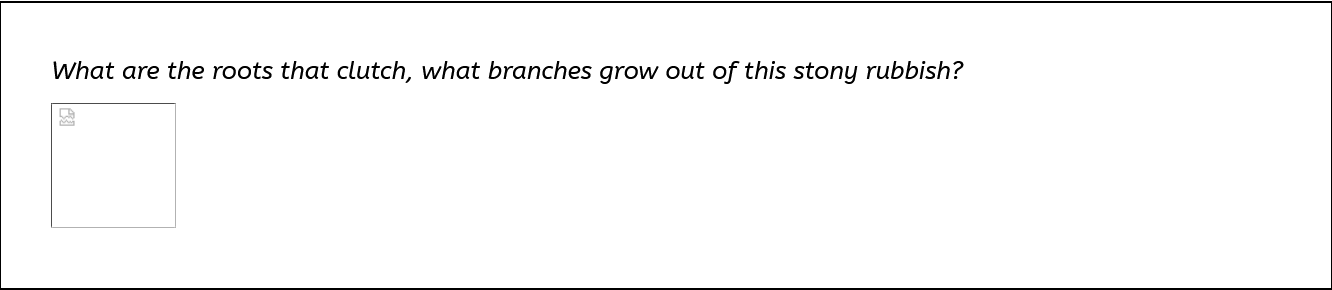
Alt text
Alt text is a text description of non-text content (such as images or videos) on a webpage. A good guide on alt text can be found on the WebAIM site, but there’s plenty of others on the internet. Now, obviously alt text is helpful for screen readers and blind people, and that is reason enough. From a business perspective, alt text also boosts your site’s SEO. But those aren’t the only reasons! Say you have a slow internet connection and an image doesn’t load, the image src attribute has a typo, or the web page had a hotlink that broke due to link rot. Without alt text, you would be presented with this:
What are the roots that clutch, what branches grow out of this stony rubbish?
However, with alt text, you might get something like this:
What are the roots that clutch, what branches grow out of this stony rubbish?
Now you have the context to understand what’s being referenced, even without an image to view.
Alt text should be one or two sentences at most, and convey the necessary parts of the image, no more and no less. A good rule of thumb is thinking about how you’d describe the image to a friend who isn’t looking at the webpage, and writing that down.
Common mistakes
- Adding redundant information like “image of…”, “picture of…”, “photograph of…”. The
<img>tag will already convey that it’s an image to a screen reader, and the visual broken image icon will do the same for a sighted user. Just describe what’s in it. - Adding non-useful alt text like “Dog” or “cup”. Having something is better than nothing, but it’s still better to describe something useful in context. If the image is really that unimportant, maybe it should be decorative instead.
- Adding alt text for decorative images. If you could remove the image and not lose any information on the webpage, then it’s decorative. For example, there’s often stock images on websites for aesthetic effect – handshakes, people smiling, a random building, things like that. Or you might find icons or images with text right next to them that describe what they are. In that case, you don’t need to write out descriptive alt text. You should still have an attribute! It just needs to be empty, to signify the image is decorative only. Media with the attribute
alt=""will be completely skipped over by screen readers. If you don’t have an emptyalt, the screen reader will still mention the image, but just say “unlabeled graphic” or “image” or something similarly useless. - Adding overly-descriptive alt text. If you have an image like this:

This description is utterly unnecessary: “A white mug with a large handle, currently filled with coffee and resting on a large quantity of scattered coffee beans. The coffee beans and mug are on a darkly stained wooden table. There are wooden wall panels faintly visible in the background.”
A better description based on context would just be: “A filled coffee mug on a pile of coffee beans.”
- Using the
titleelement as alt text. Thetitleelement is a little bit of popup information that appears when you hover over an element for a while (or sometimes, on mobile, when you long press it). It is not read out by screen readers, and is not a replacement for alt text. Note that on some browsers, alt text appears with the same styling as thetitledoes, but they’re not the same thing.
Keyboard navigation
Many users interact with webpages and apps with a keyboard only, as opposed to a mouse. This can be for various reasons, such as a disabled person having mobility issues or a power user simply finding it easier and faster. There are also some users who navigate via voice commands who benefit from keyboard-navigable pages. Usually, navigation and interaction is done via the Enter, Space, and Tab keys.
The order in which elements are navigated through is determined by the flow of the DOM. You should always have a sensical document hierarchy, and heavily consider whether things should be moved out of flow or not. Which element is currently being interacted with is shown by the :focus selector and its styling (appearing by default as a black outline around the interactive element). Therefore you should never completely remove the :focus styling, though you can change its appearance (as long as that styling is also accessible in terms of color contrast). As well, the global attribute <tabindex> can be added to elements that are not normally focusable to make them so, or to remove focus from elements that are focusable by default.
If you want to check whether your webpage is navigable only by keyboard, and you use a keyboard anyway, just try it yourself! Remove your mouse or other input, and try to access all parts of your webpage and functionality. Make sure the tabbing order makes sense so focus doesn’t jump around the page in a confusing manner. If an element that should be interactable isn’t focusable via Tab or doesn’t do anything when you press Enter or Space, you know what to fix. Be aware of keyboard traps, which are areas of the webpage that you can’t leave via keyboard alone. If you enter a widget and try to tab out, but end up going in a loop around the widget until you reach for a mouse, you’ve found yourself in a keyboard trap.
Screen reader considerations
Screen readers are most useful for blind users of your app. They read out content on the screen, whether interactable or not. While screen reader users can navigate around interactable elements much the same as keyboard navigating users, they can also navigate via <hn>, <nav>, <p>, and other elements using various keyboard shortcuts such as the arrow keys. On mobile, they can navigate via various swipe gestures and taps.
Many of the considerations for screen readers are mentioned through the rest of this documentation. Other notes:
- Don’t have images of text if you can help it (unless it’s a logo). Even if you add an
altattribute, it’s unnecessary to do this when CSS styling is right there, and generally preferred. - When using keyboard shortcuts in your application, try to use unique keyboard combinations that don’t override common screen reader (or keyboard) functionality. As well, give screen readers a description of how to use the keyboard shortcut to operate that feature, using
aria-labelledbyoraria-describedby. - Screen reader functionality differs by browser and screen reader technology. There are built-in screen readers for Windows (Narrator), Mac and iOS (VoiceOver), and Android (TalkBack), but also more advanced screen readers such as NVDA and JAWS. They will all read out text and features to different degrees of nuance and usefulness, and browsers can modify what they read out as well.
Figuring out what a screen reader is supposed to say vs what they actually say can be confusing to parse out just by scanning through the document hierarchy, semantic tags, and ARIA. How do actual users experience your site? How can you know for sure?
Why not try it out yourself?
Using the built-in screen reader on your platform of choice is usually sufficient. They tend to have fewer features than things like NVDA or JAWS, so will more likely show the gaps and flaws in your app.
- On Windows, press Ctrl + Win + Enter. Complete guide to Narrator - Microsoft Support. Press the shortcut again to turn it off.
- On Mac, press Command + F5. Get started with VoiceOver on Mac - Apple Support. Press the shortcut again to turn it off.
- On Android and iOS, you can access the screen readers via the Settings menus.
- To easily turn TalkBack off, press and hold both volume keys for a few seconds.
- To easily turn VoiceOver off, triple-click the side button or Home button (depending on the model).
Get to know the screen reader navigation tools, and try hopping around your website in various ways. As well, listen to what the screen reader says about each element on the page. If it says something inaccurate, nonsensical, or repetitive, then you know what to fix.
Vision considerations
Blindness is not the only visual disability to keep in mind for accessibility. Colorblind and low-vision users should also be taken into account.
Contrast and color
79.1% of home pages in the WebAIM 2025 report on the accessibility of the top 1,000,000 home pages had text and other elements that did not meet the WCAG 2 AA threshold for contrast. WebAIM also has a great guide on the importance of contrast. The general minimum threshold is a contrast ratio of 4.5:1, measuring the difference in perceived “brightness” between two colors. The hue, saturation, and lightness of a color can all modify the perceived contrast. The font weight and font size also determine how much contrast is required, with a thicker font weight or larger font size (above 18px) having lower criteria for accessible contrast.
There are multiple color accessibility tools out there to check your palettes and color combinations. My personal favorite is aremycolorsaccessible.com.
Color as information
Color should not be the only thing imparting information in your app, as many people can’t discern color to a strong degree, or sometimes at all. Even on the road, the colors of a stoplight are not the only things imparting whether you should go, move slow, or stop–that would be a huge problem for red-green colorblind people, for instance. Instead, the position of the lights also conveys this information: red is on the top, yellow is in the middle, and green is on the bottom (or left, middle, right for horizontal stoplights).
While you can still have color, you should add at least one other visual way to impart this information, such as different shapes, icons, or positions for each separate bit of information. There should be a key somewhere as well, to indicate what each visual conveys. Either that, or simply adding the text via a title, tooltip, or label of some sort.
Yes:
✅ Status 1 ❌ Status 2
No:
🟢 Status 1 🔴 Status 2
Relative units when resizing text
Some users with low vision need a much larger font size than the default HTML root font, which is 16px. While sometimes a zoom-in can be helpful, users can also modify the font size of webpages using their browser’s settings. This changes the appearance of the page in a different way than zooming in.
This means that instead of using fixed units like px for your CSS font sizes, paddings, margins, and so on, you should try to use relative units, which resize when the root font size changes. A great guide to CSS units is at this article on freecodecamp. This is most pertinent for responsive web design.
A short note on frameworks
Most people in the coding industry are not writing webpages with raw JavaScript, HTML, CSS, and elbow grease. They are making microfrontends, single page apps, dynamically generated components, and other complicated webpages using popular frameworks like Angular, React, Blazor, and so on. WIhile this is convenient for programmers, the frameworks’ sugar-coded shortcuts and built-in component libraries can make it even harder to remember and implement accessibility. The aforementioned WebAIM report has a list of technologies and how they fared in accessibility testing. Home pages built using Angular, for instance, had an average of ~71 errors as opposed to the general average of 51 errors on a home page. There’s no great solution for this other than to be mindful of what exactly these neat little component packages have in the roots of their code. And sometimes, a little elbow grease is needed after all.
Single page apps
One problem that can arise with single page apps is the use of “routing” within the app as opposed to proper navigation with <a> links which refresh and load a new page. This refresh is really important for screen reader technologies, clearly signalling that the context has changed so the screen reader can start from the top of the page and read down a new page that logically follows from the previous content. Getting rid of this page reload means that screen reader users might click on what seems to be a link and not know anything has changed. Accessibility-test.org has more information on this issue.
One way to address this is announcing page transitions by auto-focusing the <h1> element on the new page after routing. Blazor, for instance, has a built-in component called <FocusOnNavigate> which does this.
After navigating from one page to another, sets focus to an element matching a CSS selector. This can be used to build an accessible navigation system compatible with screen readers.
--Microsoft's FocusOnNavigate documentation
Remember…
- Accessibility should be considered from the get-go, from all teams (UX, programmers, product, testing, etc). This boosts audience interaction and satisfaction, and makes you stand out among the slew of inaccessible websites out there. As well, it’s just an equitable and inclusive thing to do.
- Design your webpage as if you need these accessibility features. One day, you might.
Comments